

In Depth: How to make your website mobile compatible

The days of building websites targeted solely at desktop or laptop environments are over. Users can and will access your website from a variety of internet-enabled devices.
Accessing the web from mobile devices is far from new. However, the popularity of smartphones and cheaper data packages from network providers have driven a sharp rise in mobile web usage, which is not just reserved for the latest and greatest smartphones.
As website owners, mobile devices also offer some fantastic features typically not available on the desktop – functionality such as clicking a hyperlink in your website to call your phone number, or adding your contact details to an address book. And with more advanced devices, a mobile website can provide more targeted, location-aware content for your visitors.

MOBILE FONTS: Computerlove's Advanced Profile on the iPhone demonstrates how the @font-face technique can be used to bring brand fonts onto a mobile site
With the growing importance of mobile devices and the diversity of access it brings, it's vital as website owners, designers and developers that we think smarter and broader about how we enable visitors to engage with our sites.
You need to have a clear policy and strategy in place for making your website accessible to as many internet-enabled devices as possible. Over the following pages, I'll look at some key lessons the team at Code Computerlove has learned while developing mobile websites. I'll cover general hopefully use and apply to your own websites.
Which technology for mobile sites?
The first question you may be asking is: What technology is involved? Well, a technology stack, served by your existing web server, and utilise your existing web development skills. You use XHTML and CSS. There's no need to invest in learning a new formatting language or resurrect an old one such as WML (Wireless Mark-up Language).
At Code Computerlove, our base-level entry devices have to support WAP 2.0, which in turn supports XHTML-MP (Mobile Profile) and WCSS (Wireless Cascading Style Sheets). We also target high-end devices that fully support XHTML and CSS through to HTML5 and CSS3.
XHTML-MP is simply a subset of XHTML for mobile use and WCSS is a subset of CSS. Whilst XHTML-MP has been adopted and superseded by the W3C with XHTML-Basic 1.1, it's still the most widely supported XHTML variant. If you know XHTML, you already know XHTML-MP and XHTML-Basic. The same applies for WCSS.
Styles can be embedded or linked into your XHTML just like normal desktop web pages. What about more interactive technologies such as JavaScript or Flash? Support for these is inconsistent.
However, at the lowest level, like the desktop version of your website, the mobile website should still work without them.
Device diversity
To reiterate, mobile websites are built using existing web technologies. The main challenge is that given the sheer diversity of mobile devices, support for these technologies is inevitably inconsistent.
Certain devices may not support particular features, or features common to devices may be implemented in different ways. So how can you be sure your mobile website will look and act the same on all mobile devices if they all implement the technology in slightly different ways? How can you test your mobile website effectively? How can you assure your clients that their mobile website will work flawlessly on all devices?

BASIC PROFILE: The Basic profile of the site on OpenWave shows the lowest common denominator
The simple answer to these questions is … you can't! It's a tough call to make, but an important one. It's logistically impossible to set up and test all of the XHTML-supporting mobile devices that are available, as well as dealing with quirks that each device offers.
Ironically, appreciating this early on will actually help your build, testing and quality assurance processes. At Code Computerlove, we came up with a two-pronged approach to help us deal with this diversity.
Firstly we agreed to support at the lowest level, only those devices that support XHTML and CSS. Secondly, we used the concept of 'device profiles'. A device profile is simply a way of logically grouping devices.
The criteria for each group can be based on device capability, manufacturer and operating system, or by any other criteria. We created three core profiles. The 'Basic' profile covers low resolution, text-only devices. The 'Intermediate' profile includes devices that support images and have a screen resolution greater than or equal to 240 pixels (such as the BlackBerry, Nokia N95 and Nokia Xpress).
Finally, the 'Advanced' profile includes the latest smartphones based on WebKit browsers, such as the iPhone and Android phones. These profiles help us both to generalise and specialise device capabilities. They help us form a design, build and testing strategy, as well as enabling us to demonstrate to our customers how a mobile website experience will differ between diverse mobile devices.
These profiles are not set in stone. Neither are they static. Profiles may vary between projects and customers. They reflect which agreed device features are to be targeted, as well as the specific handsets we need to support.
During the life cycle of a website, new profiles may be added and old profiles removed. Additionally, they require regular reviews to guarantee their relevance and to ensure that new devices entering the market are properly assigned to the right profile.
Device profiles play an important part in our build process. We assume that all devices adhere to the basic 'text-only' profile. This is our default, fallback profile that will work on all devices. We then progressively enhance a site for subsequent profiles.

INTERMEDIATE PROFILE: The intermediate device profile for the First Group TransPennine Express site shows how it looks on more advanced mobile devices
For example, the Intermediate profile introduces a wider colour palette and the use of images. The Advanced profile extends this further by using advanced CSS3 techniques or more interactive scripting elements.
Device detection
So how do you determine whether a web page request is coming from a mobile device? And secondly, how do you determine what profile a device belongs to?
We do this by simply inspecting a web browser's user agent details and matching them up in a device capability file, which contains extended details about the device. Each web browser has user agent information about itself, such as vendor, version or operating system.
Irrespective of whether a browser is running on the desktop or mobile device, whenever it requests a page from a server, it also sends this information as part of that request. A server can then use this information to determine whether a request has come from a mobile device or not and what capabilities that device has.
To help with this, there are a number of publicly available 'device capability' files that you can use with your server-side technology. These files contain extended information about the web browser and device accessing your site, such as screen resolution, colour depth, image support, touch screen support, manufacturer and operating system.
These database files come with a number of pre-built helper methods, enabling you to integrate them easily into various server-side web technologies such as PHP, ASP.NET and Java.
At Code Computerlove, we use the paid-for subscription service DeviceAtlas. For a minimal yearly cost, this service provides us with regular database updates as well as an online database for browsing phone capabilities.
There are of course alternatives, and a popular open source project called WURFL (Wireless Universal Resource File) is available from wurfl.sourceforge.net. Alternatively, you could write your own user agent detection routine!
Testing
How do you test your mobile website and device profiles? There's no substitute for using real physical devices. Not only will you see precisely how the site will look, but you'll also experience any hardware challenges that the device will throw up, such as screen size or quirky input mechanisms.
Physical testing on every single device is, of course, logistically impossible. But you should try to obtain a few devices that fit each of your device profile characteristics. And if you're building a site on behalf of a client, it's worthwhile trying to get hold of the common handsets they use. There are also a number of software-based testing tools you can use in your daily build and testing process.

TEST AS MUCH AS POSSIBLE: The more devices you can test on the better, but testing on all devices is next to impossible
For testing your mobile site within your desktop browser, use the Firefox User Agent extension. This extension changes the browser details that are sent to your server, spoofing the server into thinking you're accessing the site from a mobile device.
It's important to note that you'll still be viewing the website via the Firefox rendering engine, not how it will be actually rendered on mobile devices. What it will show you, though, is an approximation of how your site will look across various device profiles.
For greater accuracy, there are a number of device simulators available for you to install on your development box for BlackBerry, Android, and iPhone to name a few. Furthermore, there are hosted options offered by Opera, Nokia and Device Anywhere. The latter is a paid-for service hosting thousands of genuine mobile device simulators.

IMPROVING ALL THE TIME: The Intermediate profile on a BlackBerry shows improved formatting and imagery
Perhaps one of the most useful tools is the now-defunct OpenWave simulator. It's fantastic for experiencing your mobile website against a small resolution, text-only device profile. Due to its limited nature, what you'll get is an immediate indication of whether your navigation and content work for mobile.
Multiple websites
Throughout this article, I've been discussing mobile websites as distinct entities from desktop websites. But do you need to build separate websites? Do you need separate URLs for your mobile website?
There's no right or wrong answer to these questions. In an ideal world, your website should be accessible to all devices – desktop or other – and be capable of rendering itself where possible, using the same content and navigation structure.
This singular approach works brilliantly if you know from the outset that your website is to target multiple devices as this can be factored in accordingly when planning structure, layout and content. However, if you have to retro-fit mobile onto an existing desktop site, it may be easier to run the two as separate sites.
Navigation and content that traditionally works well on the desktop may not when displayed on a mobile device. Desktop navigation may seem unnecessarily complex on a mobile device, and content may need rewriting, either to be shorter and more immediate or to be split across multiple pages.
As the amount of server-side branching logic increases to alter navigation and content for desktop and mobile, it's then a case of either re-evaluating your design, structure and content or, if the two sites serve slightly different objectives, running the two as separate instances.
At Code Computerlove, we've separated out our desktop and mobile website. We've found this easier when internally managing site assets such as style sheets, scripts and images and server-side logic.
We are, however, in a convenient position in that our content management system enables us to share content between multiple websites. So, while both are distinct sites, there's crossover and shared content between both.
Do you need a separate URL to distinguish your mobile website from your desktop website? Again, there's no right or wrong answer to this: it's purely down to your own requirements. You don't need a '.mobi' domain, an 'm.' subdomain or a 'mobile' folder as part of your main website's URL.
At Code Computerlove we've used the 'm.' sub-domain approach for mobile – for example, m.codecomputerlove.com – and www for desktop, as this suits our requirements.
If a mobile device browses to the desktop URL, it's redirected to the mobile site. The mobile site contains a hyperlink that enables the visitor to navigate back to the desktop site if they wish to. Conversely, if a desktop browser visits the mobile site, we don't force a redirect back to the desktop version.
Structure and content
Due to restrictions on screen real estate and the various input mechanisms used by mobile devices, relying on a traditional multi-column desktop-based layout doesn't work. This is true even for smartphones that accurately render desktop websites. The novelty soon wears off when scrolling through and zooming around desktop-targeted websites.
At Code Computerlove, we've developed a standard template structure for our mobile websites, initially based on a template that can be found at MobiForge.
This template follows a single-column, fluid-width design. What this means is that the user need only ever scroll vertically and that the page always fits the available width of the mobile device's web browser. The template is purposely 'light'. It encourages simple navigation with tightly written, relevant and focused page content.
Additionally, the template promotes the use of clean and simple XHTML markup that mobile devices with limited processing capabilities, memory and variable network speeds are able to render quickly.

MOBILE TEMPLATE: This diagram will give you an idea on how to structure a mobile website
The template is composed of a header containing the company name or logo; top and bottom breadcrumb trails displayed on all pages except the homepage, enabling the visitor to navigate back through the site with ease; a page content area; sub-navigation links; and a footer containing copyright information plus, more importantly, a hyperlink to the desktop version of the site.
Final tips and tricks
To wrap things up, here are a few final tips and tricks to help with your mobile website development:
Mobile-specific META tags
A number of XHTML META tags that are specific to mobile websites can be used in addition to the common tags such as author and description. A review of these can be found here.
One important one is the viewport META tag, which can be used to set the initial scale of the width of the site to fit the screen. This is especially important for iPhone browsers. It forces your mobile website to fully fit the screen at the correct resolution and prevents the user 'zooming' into a page, for example:
CSS and presentation tips
Given the variable nature of screen resolutions, it's best as a rule to stick with relative units such as percentages and ems. Relative units will help when it comes to making a quality and scalable mobile design. With perhaps the exception of more advanced smartphones, fonts and sizes are in general poorly supported.
It's best to assume that most devices will only use their default font faces and sizes for XHTML elements. CSS background images tend to be well supported. However, your design must work well in the event that they aren't.
We did find a glitch with BlackBerry browsers. To ensure maximum support, make the URLs to your background images absolute, not relative, to the style sheet.
Image resizing and scaling
It's preferable not to push full-size desktop-targeted images to mobile users. Where possible, ensure your images are optimised accordingly. There may be instances where you need to scale images dynamically on the server to match the screen resolution you're serving to.
If you're using DeviceAtlas for browser detection, you can obtain the actual screen width of the web browser and rescale the image accordingly, using such tools as ImageMagick or any other server-side image manipulation library.
Google Analytics
Avoid using the default JavaScript-generated code. Many mobile devices don't support JavaScript and so using the default code will distort your website statistics. Google now offers tracking code options that are targeted specifically for mobile devices.
This code does not rely on JavaScript. You can find the option under the Advanced tab in the section where you normally generate your tracking code from.
 |  |
Read More ...
Review: Norrkross Movie
 While iMovie gains significant features in every new release, there's still a big leap from it to Final Cut Express, with regard to both accessibility and capability. Norrkross Movie is aiming to fill that space with some high-end options packed into an intuitive layout.
 The important steps up from iMovie are the addition of persistent tracks in the timeline for layered editing and compositing, a much wider range of file import options, a larger choice of effects, and several options for keyframing and nodal compositing of video.
Options aplenty
The tracks all have an icon that shows how they interact with the others around them. It's set to overlay by default, but you can add colour-adjusted transparency effects in a matter of seconds. The difference between most of them is subtle, but the sheer choice is impeccable.
A proper timeline means keyframing of effects can be introduced, and it works well here. It can either be added using just the canvas and timeline, or precisely controlled using the Filters Node View on the left.

Our issue with the tracks is that there's no separation of the audio from the video. iMovie enables you to overlap the audio from one clip to another in the precision editor, but in Norrkross you'd be forced to use an overlay edit to hide the first clip from view, and reduce the volume of the second clip to 0. It's clumsy in practice, and we'd prefer the chance to address editing the audio directly.
The inclusion of nodal compositing is very interesting indeed. Its only appearance in an Apple product is in Shake, part of Final Cut Studio, so we're talking about a fairly professional feature. It effectively enables you to add multiple filters to a clip and then see and control the order they're applied.
For example, if you wanted to remove a green screen background on a clip but also apply motion blur, you can use the nodes to ensure the Make Color Transparent clip is applied before Motion Blur. If it were the other way around, you'd be trying to remove green that blurs into your subject. It's a subtle tool, but one that offers a lot of headroom once you gain confidence with it.
A huge advantage of Norrkross is its ability to handle just about any video format your Mac can play – we even managed to import WebM video without any problems. However, it can't capture footage, only import files. Neither can it export to many formats, but it can do various video sizes in H.264.
The real problem with Norrkross is a lack of polish. There are typos in menus, and the Hide Toolbar option doesn't change to Show Toolbar once you've hidden it. You can't position the playhead and then drag to it a clip to trim, because the action moves the playhead.
There are also far too few keyboard shortcuts, and what is there is often convoluted.
Flies in the ointment
CPU usage can occasionally spike for no discernible reason, and the Media browser can only be viewed as a windowed overlay, but it would be best as a tab in the main program.
If you're looking at upgrading from iLife '09, Norrkross offers strong features at an appealing price. If you've already got the latest iMovie, it's a tougher choice.
Related Links
| |
Read More ...
In Depth: OS X Finder tweaks to speed up your workflow
 Think about your most-used Mac apps. You might choose Safari, Pages, iPhoto or iTunes. However, an app that might escape your furious list-making is Finder, largely because the Mac's file-browser is so ubiquitous that people often forget it's an application.
 Finder is designed to be sleek and efficient, providing you with various ways of accessing and viewing documents on your Mac. But like many Apple apps, it's also multi-layered, having by default a simple setup, but offering extra options 'under the hood'.
We'll look at some of the best options, show how to access and activate them, and detail how they can speed up your workflow.
If you find the current Finder a little too cluttered and pine for the simpler days of Mac OS 9, windows can be changed to resemble those from Apple's older system. Click the pill-shaped button at the top-right of a Finder window and the toolbar and sidebar vanish.
This also reverts Finder to a more 'spatial' model; when accessed from within Icon view, clicking folders opens them in a new window, and you cannot open the same folder in multiple windows – instead, Finder reveals the window that's already displaying the folder you're trying to access.
01. The default setup
If you've not made any changes to Finder's setup since you've had your Mac, it will resemble what's shown in the grab above.

Finder window toolbars will show the Spotlight search field and eight buttons: Back/Forward, the four views (Icon, List, Column, Cover Flow), Quick Look, and Actions. On the desktop, icons for files and folders will be scattered around, positioned wherever you left them, and only some volumes will be visible.
02. Tidy your desktop

There are two steps to a neater desktop. First, go to Finder > Preferences. In General, uncheck volumes you don't want to show on the desktop (bearing in mind mounted volumes can be accessed from Finder window sidebars). Then go to View > View Options and set Arrange by to Name to force items to be listed alphabetically.
03. Show and hide item info

Leave the View Options window open. Keep an eye on the items on your desktop and check Show item info. You'll see that for certain document types, additional information is displayed. This option can in fact be set for any folder (via the View Options window) when you're using Icon view.
04. Tweak icon mode

On the desktop, icons are restricted to a maximum size of 128x128 pixels (adjusted by using the slider in the View Options window). However, open another Finder window, change it to Icon view (via the toolbar button) and drag the slider to the right. At its maximum setting, icons are 512x512 – handy for PDF and image previews.
05. Control column sizes

Column view also has some handy resize tricks, this time relating to column widths. You can drag each column's widget, but a double-click stretches a column to fit the longest item's name. Option-click a widget to expand all columns in this way. Shift+Option-clicking expands all columns to match the widest. Option-drag to resize columns manually.
06. Customise Finder windows

Finder windows can be customised. With the sidebar, system-level items are toggled using the Sidebar section of Finder's preferences, but you can drag any file, folder or app there as a shortcut. (Drag a link out of the sidebar to remove it.) You can also drag items to the toolbar; To remove an item Ctrl-click and select Remove Item.
07. View path information
View > Customize Toolbar offers access to more buttons. Path is useful for rapidly moving up a folder hierarchy. Use View > Show Path Bar for an always-onscreen equivalent at the bottom of each Finder window. Path-bar folders can also be dragged and dropped, and items can be dropped into them.
| |
Read More ...
Review: Softhing Entourage Time Machine 1.0
 Entourage is the email app that comes with Microsoft Office for Mac. Some people prefer it to Apple's Mail. Others (like us) use it because IT departments insist on it, typically to work with a Microsoft Exchange server, although Mail also now supports Exchange.
 Entourage's problem is that it stores mailboxes in a single file called 'Database'. Most people hang on to emails as a record, and it's not ideal to have all your eggs in one large basket.
Any file that's constantly read and written is liable to corruption. And if you include it in your backups using Mac OS X's Time Machine, that's a big chunk of data to update.
Entourage Time Machine from Softhing aims to help. With one click, it copies all your messages to a set of XML files. You can then browse and search these in a viewer.
It's simple and it works, but not perfectly. Currently only POP accounts are handled. Archiving around 50,000 messages, we found the initial backup glitchy.
Incremental backups are quick, but they can't be automated. The viewer only shows plain text, so HTML emails are garbled. The developers claim searching emails is faster than with Entourage.
But entering search terms often gave us an error, and when it worked it was slow – as was folder switching. The app's not quite there yet, but it has some interesting potential.
Related Links
| |
Read More ...
Guide: How to solve a Rubik's Cube
 We've all seen the algorithms for solving Rubik's Cube by hand using a step-by-step approach: get all the corners done, then get the side cubelets done. Or: do a complete side, then do the next one, then the next.
 There are several approaches and, by dint of some fairly rigorous practice, experts can solve a cube in under a minute. But how jumbled can a cube get? Or, to put it another way: what's the minimum number of moves necessary? Enter God's Algorithm.

Way back when, I studied mathematics at Kings College, London. Every year, in the summer term, the Mathematical Society organised a weekend away in Windsor Great Park, where we'd invite guest speakers to present topics we wouldn't normally encounter in our regular maths courses.
Gleaning the cube
In 1979, we had Professor David Singmaster as our guest. His topic was a brand-new toy called Rubik's Cube – not yet officially available in England – and the use of combinatorial mathematics to solve it.
The cube had been invented by Erno Rubik in Hungary some five years previously and at that point Ideal Toys were just on the verge of licensing the cube from Rubik for worldwide distribution. Singmaster had a set of cubes with him that we could buy and, needless to say, after his talk he sold the lot.
Within a couple of months, I'd got the art of solving a cube sufficiently practised that I could regularly solve one within a couple of minutes. As we were maths students, we understood the mathematics behind the cube.
The initial solution that Singmaster discovered used combinatorial mathematics to solve it. In essence, he'd devised a set of combined moves (let's call them Moves, each containing about seven to 12 individual face rotations), that would move around three corners or three sides.
All of the Moves were of the form aba' – that is, a set of rotations a, followed by a single rotation b, followed by the reverse set of rotations that formed a.
Instead of hopelessly randomising the cubelets, the Moves were designed to only swap the positions of three cubelets around. By identifying three cubelets that were out of position, you could solve the cube by repeatedly applying these Moves.
I practised two Moves by heart – one to swap three corners, one to swap three side cubelets – until I could do them in my sleep. With my tuned cube, that meant I could solve a random position in about two minutes. That's not a brilliant time to be sure, but acceptable.
Two questions left open at that time were: how randomised could you make the cube, and what would be the optimal number of moves that an omnipotent solver – in other words a solver who could perfectly analyse the cube – would take in order to render the cube to its default state?
Obviously our combinatorial solution would require many moves – possibly 100 – but what about if you could visualise the solution perfectly? 10? 20? 42? This optimal cube analysis became known as God's Algorithm, not because there is such an algorithm necessarily, but because it gives us something to aim for in our ever-better algorithms for solving the cube.
Back in 1982, Singmaster hypothesised that God's Algorithm might only need a number of moves "in the low twenties", but he was unable to refine that hypothesis much further.
The magic cube
Before we can even begin to solve the cube, we need some notation so that we don't drown in descriptive phrases. Even today, we still use the same notation devised by Singmaster back in 1982 in his book Notes on Rubik's Magic Cube.
The Cube consists of three types of cubelets, assembled together with what looks to be utter magic in a 3 x 3 x 3 cube.

There are 12 edge cubelets, each with two faces of different colours.

Similarly, there are eight corner cubelets, each with three visible faces, with each face a different colour. Finally there are six centre cubelets each showing one face.

The centre squares form the sprung matrix that holds it all in place.
These centre pieces define the colour of their sides in the solved state. Hold the cube in front of you, such that there is one side directly facing you. The six sides of the cube are called Front, Back, Left, Right, Up and Down.
We use Up and Down instead of Top and Bottom because we're about to use the initial letters to signify the rotations of their respective face, and to use both Bottom and Back in this case would clash confusingly.
The letters F, B, L, R, U and D denote a clockwise quarter-turn of the respective face. By clockwise we refer to the direction you rotate the face if you were looking directly at it. A half turn of a face is denoted by either repeating the letter (for example, FF or UU) or by squaring the letter (such as B2 or R2).
A quarter-turn anti-clockwise is denoted by using a prime mark or apostrophe (such as D' or L'). Of course, a quarter-turn anticlockwise could be denoted by repeating a letter three times, but this is rarely seen.
Cross wits
As an example, here's how to get the simple crosses pattern from a default cube: L2R2U2D2F 2B2 (or LLRRUU DDFFBB). To return to the solved cube, just reverse the moves.
For the cleverer looking centre dots pattern, try L'R•U'D•B'F•L'R (here I've separated the moves in pairs to make it easier to see what's going on). Again, to return to the pristine cube, just reverse the moves.
Singmaster's original solution was in three main stages: First, choose a colour (I always go for white as it's the most visible) and then restore that particular face. In general, you do this by first restoring the edge cubelets and then the corner cubelets.
CROSS PATTERN: Putting the Cross pattern on the Rubik's Cube can set you up for some quickfire puzzle-solving
Second, restore the middle layer. This of course means making sure the four edge cubelets are properly positioned and in the correct orientation.
Third, restore the final face. Singmaster did this part in four main phases: flipping the edge cubelets so that they all showed the final colour, forming a cross with the centre cubelet (of course, they could be in the wrong position); restore the edge cubelets to their proper position; place the corner cubelets in their proper position (although they may be oriented incorrectly); twist the corners until they are in the correct orientation.
Singmaster's algorithm was guaranteed to solve the cube, but the number of moves was not optimal in any sense of the word. It could take over 100 moves to solve the cube using his algorithm.
Once Singmaster had published his algorithm (a solution that required you to learn six basic Moves and then apply them over and over), the race was on to reduce the number of moves drastically in order to solve the cube more quickly.
Quite soon after Singmaster published his initial book, Jessica Fridrich devised a four-pass algorithm known as CFOP (Cross, First two layers, Orient last layer, Permute last layer) that proved to be extremely fast for the new sport of speedcubing – that is, solving the cube very fast in competitions.
Unfortunately, the algorithm requires the knowledge and use of some 120 Moves, but offset against that a practiced speedcuber can analyse and solve a randomised cube in about 55 rotations.
Picking up speed
Philip Marshall then described an algorithm that only required learning two Moves (plus the art of knowing how to recognise when to apply them), but that would solve the cube in somewhere around 65 moves.
It's a five-step process: Cross, centre section edges, top edges, five corner pieces, end game. Next up was Lars Petrus' method, which he devised at roughly the same time as everyone else in the early '80s.
He decided to avoid the traditional layered approach used by everyone else and to restore the cube from one corner, building it out via a solved 2 x 2 x 2 cube, to a 2 x 2 x 3 rectangular block (otherwise known as a cuboid) to the completed cube.
Although the first few passes use several types of Moves, the final stages of the Petrus System only use three. Overall the cube can be solved in 45 moves, provided that time is available to study the cube in advance.
In speed contests, the number of moves increases somewhat to something in the region of 60 moves because there's less time to study the cube in order to devise the most efficient solution. Apart from some tweaks of these methods over the years, that's where human-solving now stands.
The fastest speedcubers use some variant of these methods. But what about computer solutions? Can they get closer to God's Algorithm through lengthy analyses of the randomised cube?
The first approaches were made by professor Morwen B Thistlethwaite at the same time as Singmaster was explaining his method, and were published in Scientific American in 1981 by Douglas Hofstadter. In essence, Thistlethwaite divided up the solving process into subproblems.
Rather than concentrating on solving portions of the cube and endeavouring to not jumble up those parts as you tried to solve the remainder of the cube, he concentrated on the kinds of moves you were allowed to make. To do this, he made use of group theory and searching by computer.
He started off with what's known as the cube group. This is a mathematical group whose operations are all the usual moves we've discussed here: F, B, L, R, U, D and the moves obtainable from them (F 2, F', B2, B' and so on).
The number of possible positions in this cube group is immense: 4.3 x 1,019. He then posited another smaller group, one that only allowed the following moves: L, R, F, B, U2 and D2 . Next he worked out a set of tables of the Moves that would take the cube from the larger group to the smaller group.
Once in this smaller group, he devised yet another smaller group that only allowed L, R, F 2, B2, U2 and D2, and then worked out how to transform the cube into a member of this group. From there he went to the next more restrictive group that only allowed L2, R2, F2, B2, U2 and D2. From this particular group it was a small search that led to the final and smallest group of all: the identity group (the solved cube).
It is important to note that Thistlethwaite's algorithm requires many searches at each step down the group chain and is only feasible for computers to do, not humans. Using this algorithm, it is possible to solve the cube in a maximum of 52 moves.
Nearing God's algorithm
The final improvement was made by Herbert Kociemba in 1992. He built his algorithm based on Thistlethwaite's by removing most of the interim groups. Kociemba's algorithm just used three groups: the cube group, the U, D, F2, B2, L2 and R2 group, and the identity group.
He called it a two-phase algorithm, because you transform the cube into a member of the smaller group, and then transform that into the only member of the identity group.
The important thing about the U, D, F2, B2, L2 and R2 group is that the orientations of the corners and edges cannot be changed using those particular operations.
Furthermore, the edges in the middle slice between the Up and Down faces stay within that slice. The first phase uses a modified A* search algorithm known as iterative deepening A* (or IDA) in order to find the moves that will constrain the corners and edges (and the middle slice) of the cube to fit into the second group.
The second phase then searches for the moves to solve the cube using only the restricted moves allowed. In fact the algorithm is a little cleverer than it may at first appear: it solves the cube multiple times in order to find the shortest solution path available.
First it uses the shortest path provided by the first search and transforms the resulting cube to the solved state. Then it uses the less successful paths from the original search and tries to transform those to the solved state.
After completing this process, it chooses the shortest path it finds as the solution. In general, it finds a path that is 20 moves or shorter to solve the cube. Note however, that the shortest path it finds is not necessarily guaranteed to be the most optimal solution.
So, Kociemba's Algorithm, although very effective, can only ever approximate God's Algorithm. We're still waiting for that one.
| |
Read More ...
IFA 2010: Hands on: Toshiba BDX3100KB Blu-ray 3D review
 Toshiba's triptych of 3D goodies is complete with the BDX3100KB 3D Blu-ray player, which joins the WL68 3D range of TVs and Satellite A665 laptop in delivering content in the third dimension.
The 3D Blu-ray market may be a small one – currently there is just one disc on sale in the UK – but this is set to explode, with a mountain of 3D content set for cinemas and the newly crowned king of 3D, James Cameron, set to release Avatar in 3D form.
If you aren't lucky enough to own a PS3, which will get 3D Blu-ray capabilities through a firmware update, then your next port of call will be buying a standalone 3D Bu-ray player.
Toshiba's BDX3100KB is a fine-looking device which features more angles that a Lady Gaga haircut.
The from fascia of the machine is almost triangular, which makes it stand out from other players on the market.

Supplied on the front is an easy to access USB, which means you don't have to fiddle around the back when playing content from a USB drive.
And use this you will as Toshiba has kindly made the TV compatible with the DivX and MKV format. So any content crimped from the web should play like a dream on the machine.
Other than the USB slot, the front has a minimal feel. There are a couple of manual control buttons – power, eject, play and stop – and an LCD screen which offers up timecode information.

Playback of discs comes with the standardFull HD 1920x1080p 3D output and this is at 24fps, so your flicks should retain that cinematic feel.
When it comes to audio, you can play either Dolby TrueHD and DTS-HD Master Audio and if you want to you can hook up to 7.1 surround sound to the player.

If you have any home HD movies that you want to play on your TV, then you can do it through the BDX3100KB as it is able to crunch through AVCHD footage. It does seem that whatever codec you throw at it, the Blu-ray player will play it.
It's worth noting that the player is BD Live compatible, so any Profile 2.0 content you want to watch, you can do so. Not that we have found anything decent out there, but the option is open to you.
We have to admit it is not the slimmest 3D Blu-ray player out there but with dimensions of 430mm x 45mm x 225mm it is not the chunkiest either.

1080p upscaling rounds off what is a rather smart device from Toshiba and one which will handle itself against the rest of the 3D Blu-ray players on the market.
The Toshiba BDX3100KB Blu-ray 3D and its its 2D companion (the BDX1100KB) have a UK release date from October 2010 with pricing to be confirmed.
| |
Read More ...
IFA 2010: Hands on: Toshiba Satellite A665 3D laptop review
 If 3D is going to take off in the UK, then it will the games industry which pioneers the technology in the home.
There's simple logic to it: if you are happy to play a fake guitar, sing into a fake microphone and wield a controller like it's a tennis bat, then it is more than likely you won't mind putting on a pair of plastic specs to play a game.
Toshiba's foray into 3D gaming is with the Satellite A665 3D laptop. The Satellite A665 comes bundled with a pair of Nvidia 3D Vision active shutter glasses, which means you can have out-of-the-box 3D playback.
Nvidia has been pushing the merits of 3D gaming for a good while now, so this means there are a number of games on the market that utilise 3D. We had a go at Prince of Persia and there was a certain amount of immersion you got that is missing from the game when played in 2D.

To power 3D content you need a fair amount of back-end chug and the A665 certainly has this in spades.
Beneath the chassis is Intel's powerful i7 processor. This is backed by up to 4GB DDR3 RAM and there's also a 500GB hard drive on board which is fairly capacious for a portable computer.

An 15.6-inch TruBriteHD display (running at 120 Hz) with LED backlighting makes sure that the 3D content you view sparkles.
The A665 is not just about gaming, though. On board is a Blu-ray player which has been spec'd up to play 3D content. It also moonlights as a rewriteable drive.

This will be a big draw for those looking to bring Blu-ray 3D into their home. The supplied HDMI connection means this will double as a 3D Blu-ray player. As long as you have a compatible 3D TV, then you are all ready.
When it comes to other connectivity, the A665 houses 3 x USB 2.0, 1x eSATA / USB combo port with Sleep-and-Charge and a Multi-Card Reader.

Internet connectivity comes in the form of WLAN, Gigabit Ethernet LAN and there is also good ol' Bluetooth inside.
The A665 has certainly been built with the 3D enthusiast in mind. The machine wants you to view as much 3D content on it as possible, which is why there is also a 2D-to-3D converter inside, which will add another dimension to movies and games in real time. It's not perfect but it does fill the current content gap.

Couple this with some meaty audio courtesy of Harman Kardon stereo speakers and Dolby Advanced Audio and this is one desirable piece of kit.
The Satellite A665 is available now. And if you have already purchased one without all the added 3D goodness, then you can download a software update from www.toshiba.co.uk/computers.
| |
Read More ...
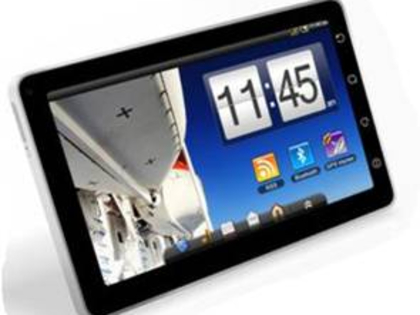
IFA 2010: In pictures: Elonex eTouch Android tablet
 Android tablets have definitely been one of the major talking points at this year's IFA. The Samsung Tab may have been one of the headlines of the event, but that shouldn't take away from other vendors such as Elonex who are also offering new tablets at competitive price points.
 The Elonex eTouch will cost 150 Euros or 199 Euros for the 7-inch and 10-inch variants respectively – there's a resistive touchscreen.


However, we have to say that Elonex has been somewhat unimaginative when it comes to design – it's a dead ringer for Apple's famous tablet. The 10-inch eTouch weighs 695g – just 15g more than the iPad.
Here the 7-inch (top) and 10-inch eTouch tablets are housed in keyboard dock accessories - there's a USB port to connect up such peripherals.


The 10-inch model is most of interest – it's sporting Android 2.1 and runs on a speedy 1GHz LNX ARM processor. That's clocked considerably higher than Viewsonic's ViewPad7 we saw the other day.
There's 2GB of on board stortage and 256MB of memory, Wi-Fi plus a micro SD slot. There's also a G Sensor for orientation.


| |
Read More ...
In Depth: The hottest tech trends of IFA 2010
 Every September, Berlin plays host to Europe's biggest gadget show, the Internationale Funkausstellung (aka IFA).
The gargantuan halls of the Messe Berlin are transformed into an Aladdin's cave of gadgetry you can look at, but rarely buy – 3D TVs, tablet computers, laptops, more 3D TVs, portable media players, Blu-ray players and even more 3D TVs.
No prizes for guessing what the dominant trend this year is...
All hail 3D TV!
Back in 2009, the big tech companies were desperate to convince us that 3D TV was more than just a techno-fad. It was a difficult sell, especially when 3D content was thin on the ground – no 3D telly channels available, no 3D gaming, no 3D Blu-ray.
A year on, the flag-waving for 3D TV is just as vigorous. Sky is inching towards the launch of its first 3D channel, while Eurosport has announced that a dedicated 3D sports channel is on the way. The PlayStation 3 will finally get its Blu-ray 3D update by Christmas, while Blu-ray 3D players and HDMI 1.4-compliant cables are becoming readily available.
Every HD TV-builder worth its salt now has a premium 3D ready range with a premium price tag to match. But only a few stand truly out from the crowd. Philips, for example, has upgraded its 9000-series HD TVs to make them 3D friendly. But it's the company's unique Cinema 21:9 model that catches the eye.

Similarly, while LED backlighting is becoming the norm, LG's LEX8 'Nano LED' 3D TV uses a thin film punctured with tiny holes to more evenly diffuse the light from the LED array. Meanwhile, Sharp has evolved its quad-pixel Quattron model to include 3D compatibility.
There's also more of an interest in 'glasses-free' 3D TV this year. Philips has long championed the lenticular technology and has another impressive demo at IFA this year. Toshiba is also reportedly taking an interest in the glasses-free approach. Nintendo is using similar lenticular lenses in the forthcoming 3DS handheld, while engineering firm Rockchip has incorporated the technology into a 3D tablet PC prototype.
Internet TV cometh
Not only will your next TV be 3D ready, it will also be able to access the Internet, play YouTube videos, display your Twitter account and stream content from the BBC iPlayer. You can already buy HD TVs with this technology built-in. However, the web widgets are often sluggish, rudimentary and hardly comparable with the internet experience you can get on a computer or smartphone.
That's going to change. Web-connectivity has the potential to change the way we watch television in the future. Google, for example, is attempting to integrate its own Google TV solution into TVs, while Apple's relaunch of its Apple TV product takes a different technology tack. Both, however, have the same aim in mind: to enable users to search, browse and stream content, on demand to their living rooms.

Content is key. Apple is well positioned with iTunes; Panasonic is ambitiously expanding its Viera Cast system; while Sony's forthcoming Qriocity portal will offer music and movie streaming. Google TV has the potential to be as successful as Google Docs or as forgettable as Google Wave. The fact that it runs the Android OS opens up a whole range of dizzying possibilities as apps can be the gateway to video and audio content, games and utilities.
Tablet PCs and iPad-jostlers
The Apple iPad has set the benchmark for every tablet PC, slate computer and smartpad to follow. It's not perfect, but the announcement of iOS4.2 will add new features and, while the current iPad might not feature a built-in camera for 'FaceTime', Apple will undoubtedly include it in version 2. Steve Jobs is the undisputed master of leaving his audience wanting more.
So rival tablet PC builders like Samsung, ViewSonic, Toshiba, Acer, LG and others don't have very long to design, test and launch their own keyboard-less devices. Samsung has taken the lead with The Galaxy Tab. Compared to the iPad, it has a smaller, lower resolution screen, but the good-looking tablet offers several advantages, including a memory card slot, two integrated cameras and Flash 10.1 support.
ViewSonic unveiled its ViewPad 7 and ViewPad 100 models at IFA, with the latter offering a dual boot feature for Android and Windows 7 Home Premium. Toshiba also revealed a tablet, dubbed the Folio 100, while Sony launched an updated version of its Reader device with a touch-sensitive display. There are more iPad wannabes to come.
Gadgets, gadgets, gadgets
Last year, IFA was much more fragmented and there were many more identifiable tech trends: wireless HD streaming; improved screen technologies like OLED and LED backlighting; web-connected TVs; 3D TVs; eco-friendliness and the end of the megapixel wars.
It's obvious from our coverage this year that 3D TVs and 3D Blu-ray players have dominated the show, with web connectivity and a new breed of tablet devices close behind. As for other gadgetry, several of the tech giants have launched new mini camcorders – Sony outed the Bloggie Touch, Samsung debuted the HMX-T10 and Toshiba has been showing off the Camileo S30 and P20.
| |
Read More ...
IFA 2010: Hands on: Philips Cinema 21:9 Platinum Series review
 Philips' Cinema 21:9 LCD TV was certainly unique. As it was the only telly with a 21:9 aspect ratio, for (rich) people wanting a true in-home cinema experience from a TV it has been the obvious choice.
However, it wasn't perfect. It used old-school CCFL backlighting, which meant contrast levels and the handling of motion did not match up to Panasonic's plasmas or even Philips' own 'LED Pro' Direct LED TVs.
And of course, it wasn't 3D capable.
This has all changed though, with the launch of the 58-inch Philips Cinema 21:9 Platinum Series TV. It's a couple of inches bigger than last year's 56-inch model, although due to the bezel being slimmer, the actual size of the TV has not changed.
It also incorporates full-blown 'LED Pro' Direct LED backlighting, 400Hz and Perfect Pixel HD Engine picture processing as well as top-and-sides Ambilight.
Over 1,500 LED's are used as a backlight behind the LCD panel, meaning it's much brighter than the first 21:9 model, while also massively improving the contrast ratio.
Behind the scenes it's also packing Philips' new 'Bright Pro' tech which helps to boost light output in the bright sections of the screen, while the dark areas remain dark. Combined with localised dimming, it has to be seen to be believed.
Away from the eyes of the public, Philips was showing the new 21:9 screen next to the older model and it made it look fairly ordinary in terms of motion smoothing, brightness, contrast, colour reproduction and sharpness.

We're always slightly amused by the way TV manufacturers like to talk about their new TVs being the best available, and then a year later when they have new products they start talking about the flaws in the older products and why the new ones are much better.
3D comes to Philips TVs
The Philips Cinema 21:9 Platinum Series is actually Philips' first 3D TV, and it uses the same active-shutter 3D tech as the likes of Panasonic and Sony.
The other forthcoming Philips 3D TVs will require external emitters for synchonisation with 3D glasses, but the 21:9 set, being the luxury item that it is, has four of these emitters built into its frame.
The 3D performance of the Platinum Series was excellent. Watching in the 21:9 aspect ratio seems a lot more comfortable on the eyes than traditional 16:9 sets – the added screen space really did add to the sense of depth.

However, while Philips says it has gone to great length to eliminate 3D's biggest weakness – cross-talk (where the two images bleed into each other) – we found this side of things to be a bit hit and miss.
The cross-talk seemed more pronounced than on the latest Panasonic VT20's for example. Is this down to the longer response time of LCD panels in comparison to plasma? Possibly.
All in all though, the Philips Cinema 21:9 Platinum Series is a breathtaking 2D and 3D TV. We really were impressed by it and are excited at the prospect of getting hold of a sample when we're back in the UK.
Now, if only we had a living room big enough to incorporate it and the money to buy one.
Expect a full TechRadar review to come your way in due course.
| |
Read More ...
IFA 2010: Hands on: LG 31-inch OLED TV review
 The big TV manufacturers have been talking about OLED technology for a long time now, and yet the largest screen size currently available is a somewhat pitiful 15-inches. And the price? An intestine-tangling £1,700. No, we can't afford one, either.
The superior picture quality of OLED (organic light emitting diode) TVs is achieved by passing an electric current through an emissive, electroluminescent film. This technique is thought to produce better colours and higher contrast and also enables screens to be extremely thin and flexible.

The main drawback is that the tech is in its infancy, and so yield-rates are very low. It's very difficult to create pixel-perfect OLED panels without any flaws, and that means the prices of producing and therefore buying them is prohibitively high.
However, LG has been tinkering with OLED tech for a while now and first showed off its 15-inch model, the LG 15EL9500 at IFA 2009. It went on sale only very recently and now we've been treated to a first look at the Korean company's stunning 31-inch effort.

The differences between this larger OLED screen and the LCD and plasma efforts around it are immediately obvious. It's just so bright and vibrant. Full HD source material looks simply stunning – TV company's carefully choose what pictures they display on which displays at shows like this, and the choice to display colourful footage of flowers and trees, as well as animations worked a treat.
3D pictures also looked extremely impressive, with the added brightness over LCD equivalents making it truly stand out from the crowd.
We can't praise OLED tech highly enough. It's just such a shame it's taking so long to make it into the homes of ordinary people.
| |
Read More ...
No comments:
Post a Comment